SaaS Medical Service Ordering Product
Order Utility
Product Overview
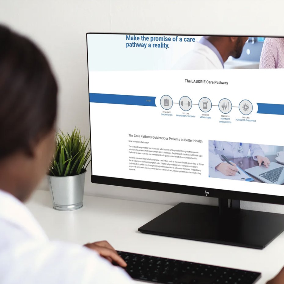
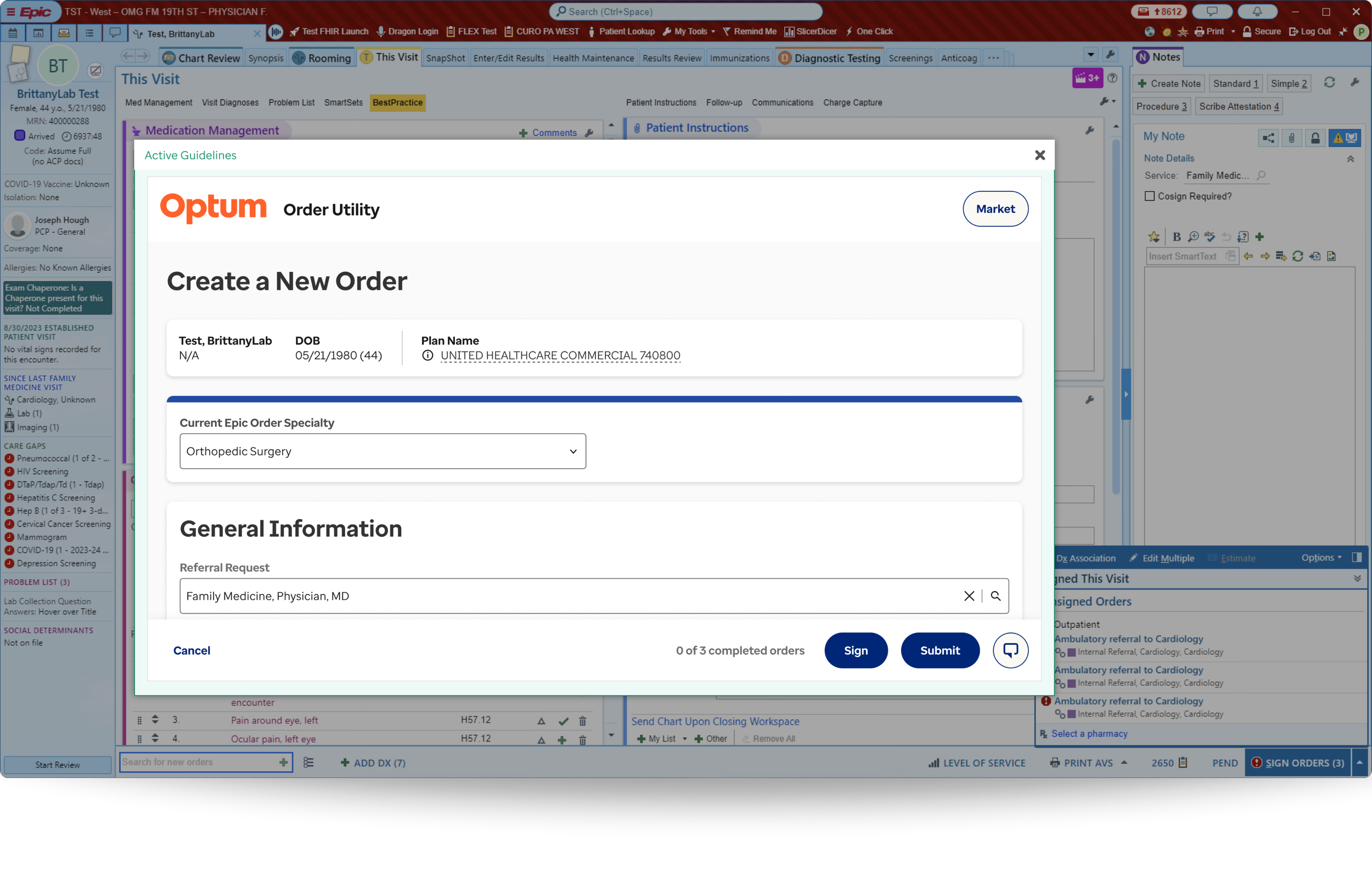
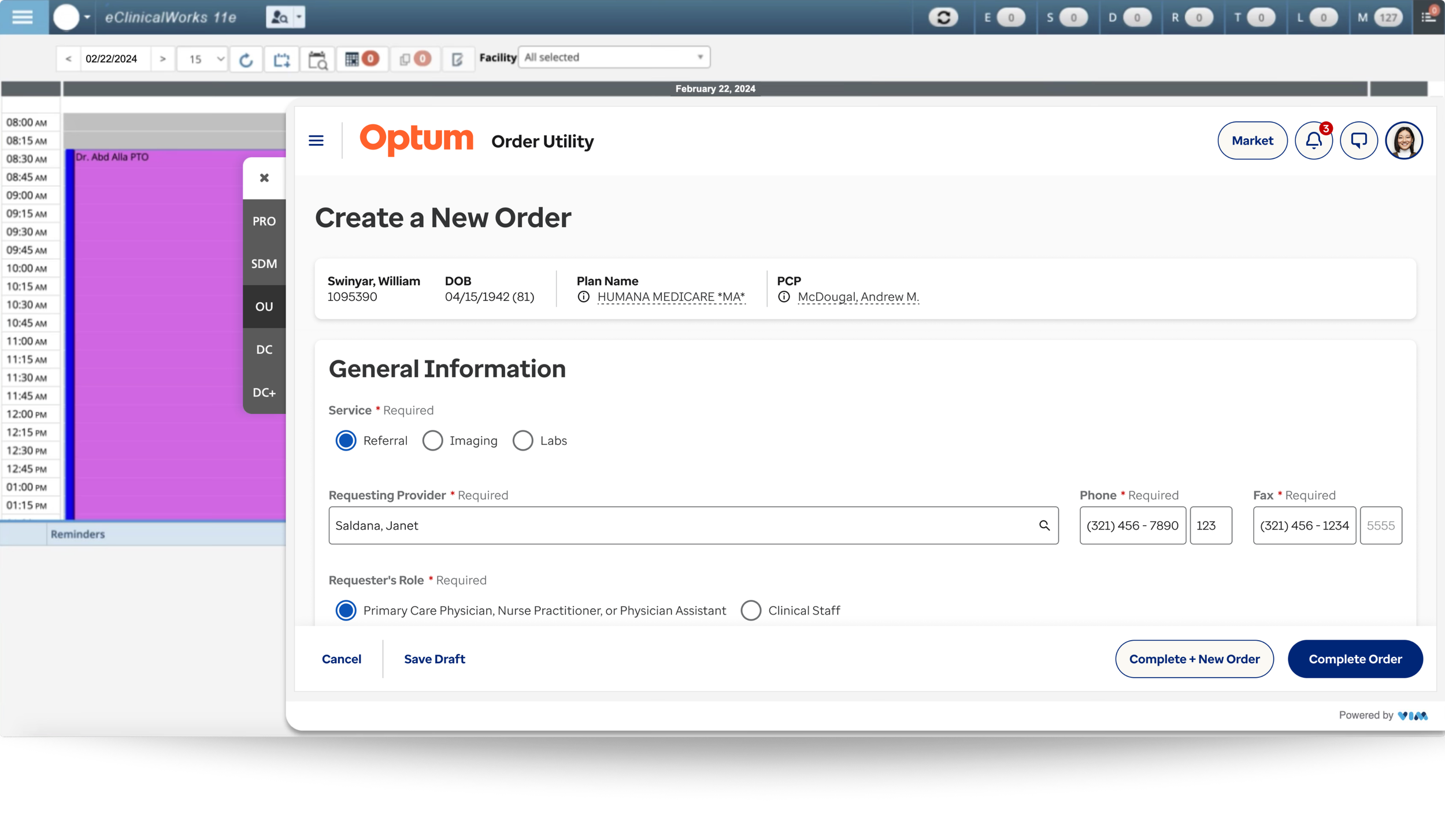
Order Utility, formerly Referral Utility, is used by thousands of healthcare professionals across the United States for over five years. It is a technology-driven SaaS product designed to optimize the ordering, authorization, and delivery of medical services by embedding evidence-based clinical criteria directly into the EHR (electronic health record) to ensure appropriate, cost-effective care at the point of ordering.
Multiple display resolutions within various EHR integrations
Each market’s submarkets can configure their own UI requirements, including but not limited to:
Fields
Specialties
Treatments
Diagnoses
Clinical questions
4
EHR Integrations
Epic, Altera TouchWorks, eClinicalWorks,
and athen
2,200+
Facilities
Comprises 90,000+ physicians across
2,200+ hospitals and clinics
1,543
Companies
These include CDOs, Markets, and Submarkets
24.43%
Market Share
Out of 20 competitors, only 1 ranks higher Health Analytics industry
Role
Senior Product Designer
Responsibilities
Research, IA strategy, and UX/UI for all enhancement and maintenance designs
Surfaces
80% desktop • 20% tablet
Duration
Nov 2021- May 2025
The Challenge
01
What & Why: Users require an order flow that is concise and requires little effort to complete without experiencing click fatigue and scroll fatigue due to unnecessary whitespace.
Efficiency over Effort: Maximize user productivity and mental energy by removing physical and mental effort, ensuring every interaction is purposeful, and using whitespace with functional intent.
02
What & Why: New users need an intuitive interface that uses standardized industry language with well categorized content, because they face cognitive overload from a bloated interface, driven by feature growth from new client requests that address their market’s needs and requirements, resulting in a disconnected, fragmented user experience.
Scalability with Clarity: Build a future-proof, agile, scalable interface that ensures new elements and features do not degrade the user experience or cause information fatigue.
03
What & Why: Users experience a conflicted visual hierarchy and CTA overload due to the product’s high level of configurability to customize content and CTAs, and to exposure control for elements and features such as fields, references, and clinical questions (for evidence-based care) for each market and its submarkets, resulting in a unique interface. Although some elements and components are invariable and required across all instances, one of Order Utilities' value propositions is its ability to give markets flexibility in interface configuration.
Structured Configurability: Establish a robust yet cohesive design framework that resolves the complexity of unique market/submarket requirements into a disciplined visual hierarchy, ensuring every interface remains intuitive, uncluttered, and focused on essential decision-making for all users.
04
What & Why: Users are frustrated by the high latency when loading Order Utility in their electronic health record system. This is primarily due to API integrations with EHRs, which are outside the team’s control. However, when a user experiences a delay while transitioning from an EHR to Order Utility, it creates a "micro-frustration" that disrupts their mental flow. Repeated occurrences cause the user to lose trust in the tool, regardless of the product’s experience and usefulness.
Prioritize Performance: Safeguard and uphold the highest standards of reliability and speed by optimizing every internal interaction point, ensuring technical latency never becomes a barrier to critical, time-sensitive decision-making in patient care or to the user’s perception of system reliability.
05
What & Why: Optum is requiring all products in its portfolio to update and adhere to the new brand standard guidelines to ensure consistency and user and market recognition.
Ecosystem Cohesion & Trust: Reinforce professional authority and institutional trust by aligning UI components with universal brand standards so users can navigate different Optum products using existing mental models. Optum is a massive organization, and brand consistency is not just about aesthetics–it is about cognitive fluency and reducing the “re-learning” phase.
01Solution
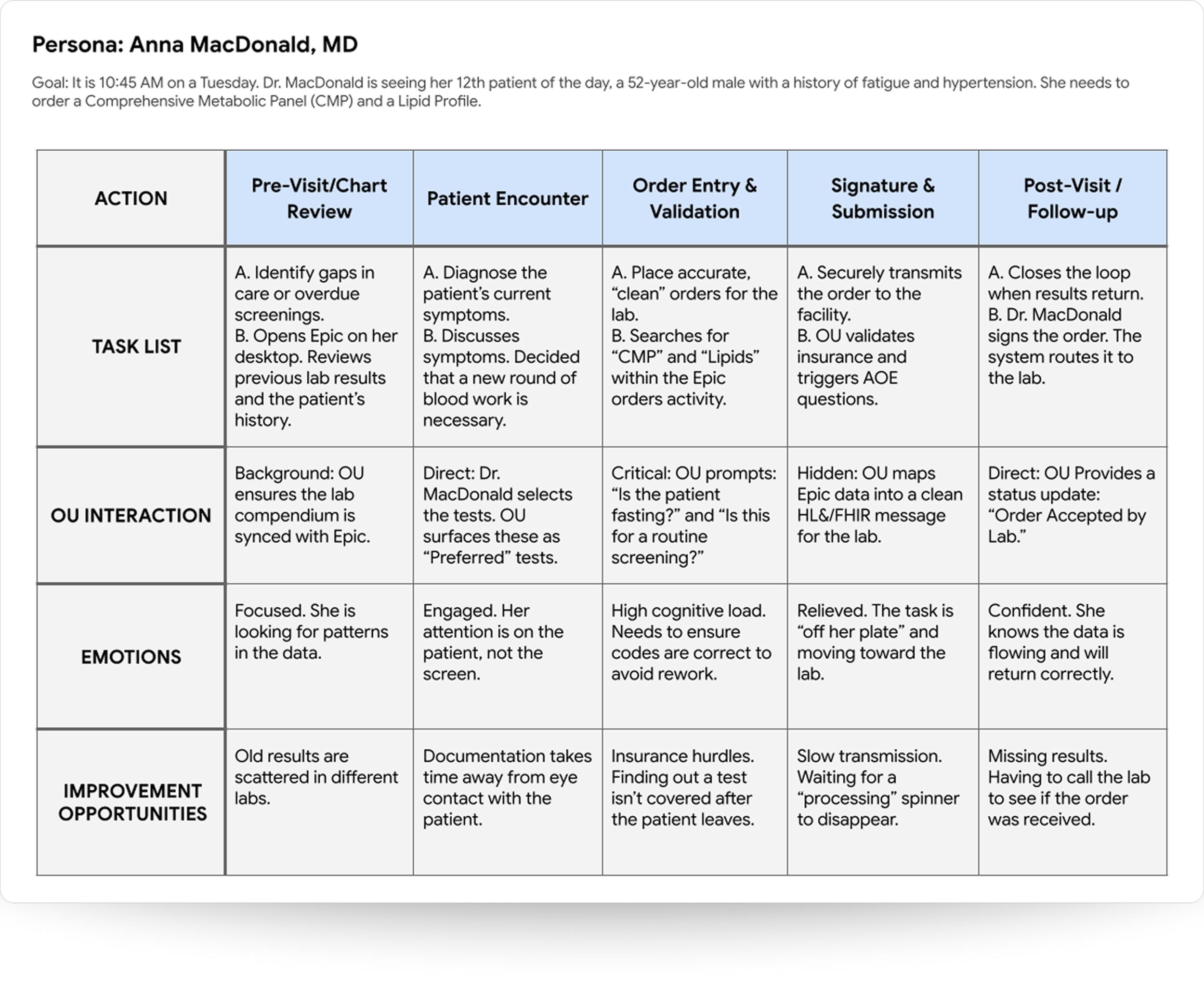
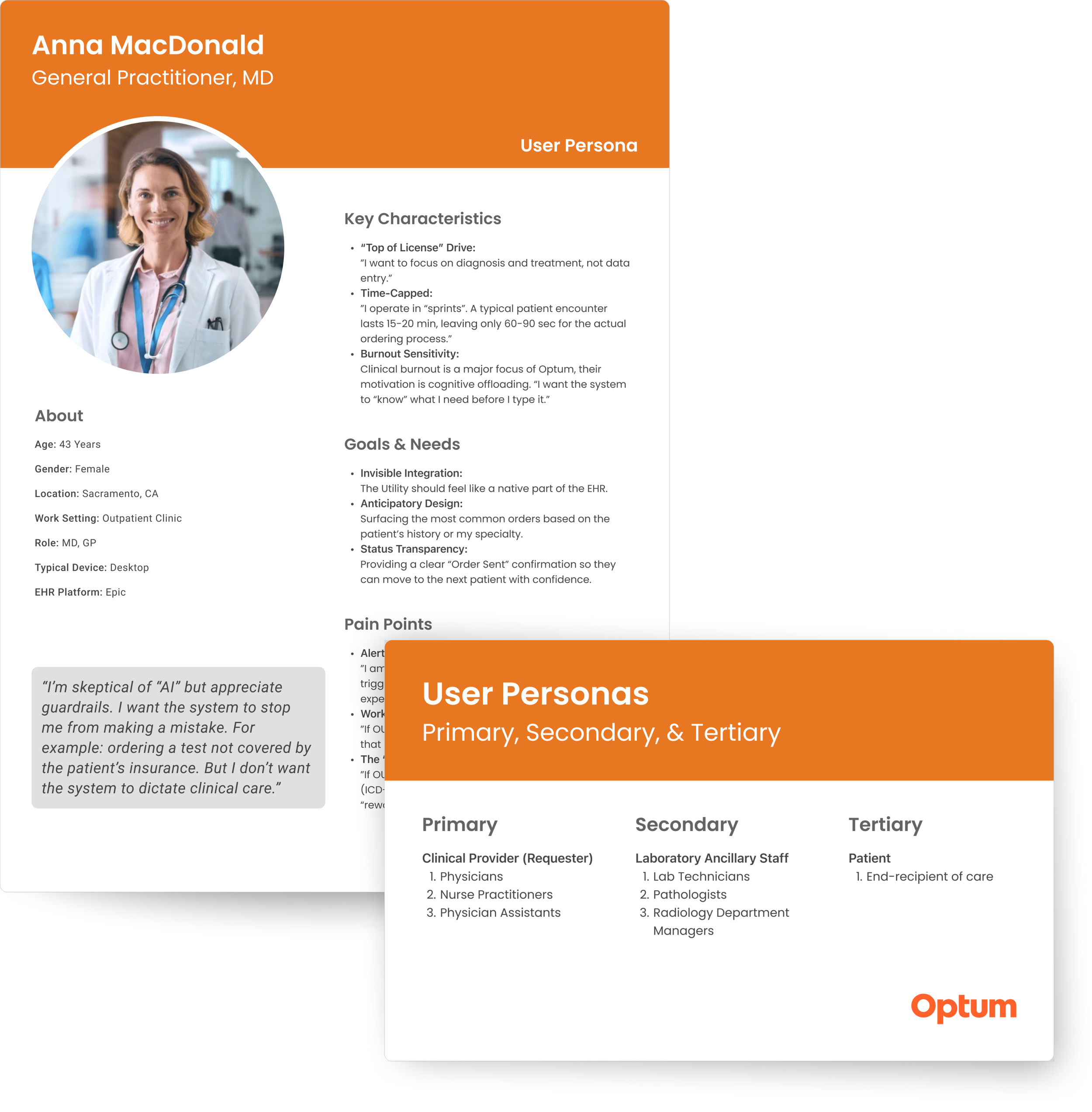
Created user persona definitions and journey maps with the business team to better understand the goals and frustrations of our users. For the most part, Order Utilities user personas have not changed since their inception; however, as technology and the product’s capabilities have evolved, users’ goals and pain points likewise shifted.
Results
Our team already understood many of the pain points our users had voiced; however, through this exercise, we uncovered additional opportunities for improvement that we could address through a design and content reorganization overhaul of the product.
02
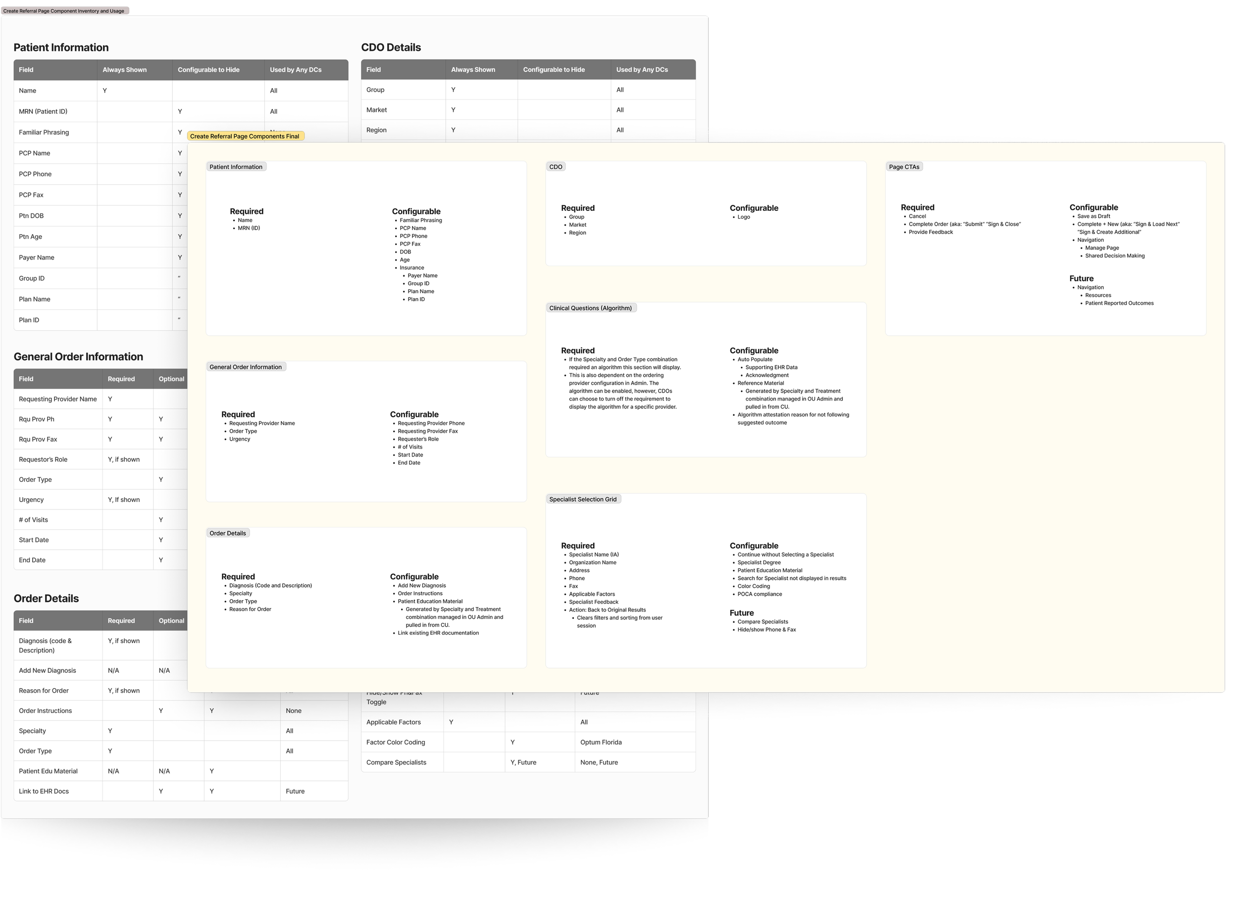
Solution
Worked with the business team to better organize fields and features by grouping related content intuitively, removing unused and superfluous content, and nesting explanatory/directional text behind tooltips.
Results
These actions further reduced scrolling, unused whitespace, and content overload.
03Solution
Researched, implemented, and presented a four-step wizard form concept to internal stakeholders and users during monthly “User Group Sessions”.
Results
This approach reduced seconds from load times by limiting the number of fields and loading data in parallel. It also reduced the “scroll fatigue” users were experiencing.
04Solution
To manage customization challenges, implemented visual styling guidelines for CTAs and reorganized action items by utilizing the header and the footer for different CTA classifications.
Results
This approach facilitates consistency across varied client configurations and addresses challenges with visual hierarchy and action overload.

Static header navigation.

Sticky header with patient details.

Sticky footer with primary CTAs.
View examples below!

05Solution
I worked one-on-one with the branding team to create components and features tailored to Order Utility but could be used in other Optum products, and implemented the new Optum brand styles and components.
Results
In addition to meeting Optum’s brand standards and creating unity and continuity across products, the high-fidelity mockups leverage the ready-made Figma components and style guide.
-
![]()
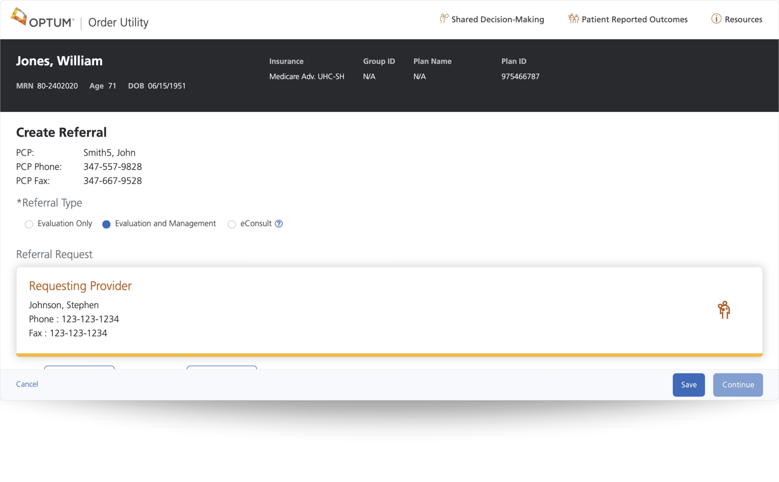
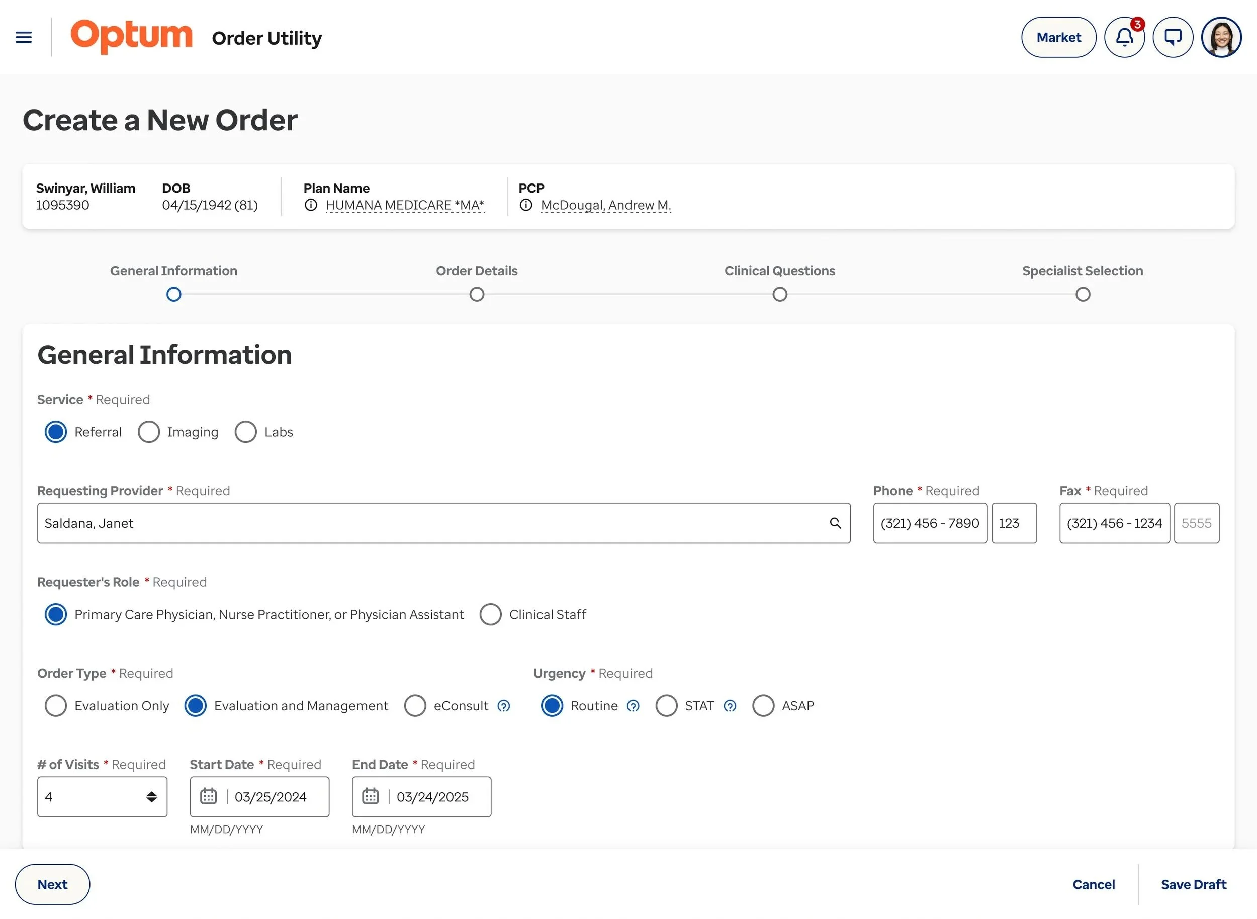
Step 1
General provider information and order urgency. Markets can choose to skip this step by pulling data from the integrated EHR. Therefore, when the user opens OU they would start on Step 2: Order Details.
-
![]()
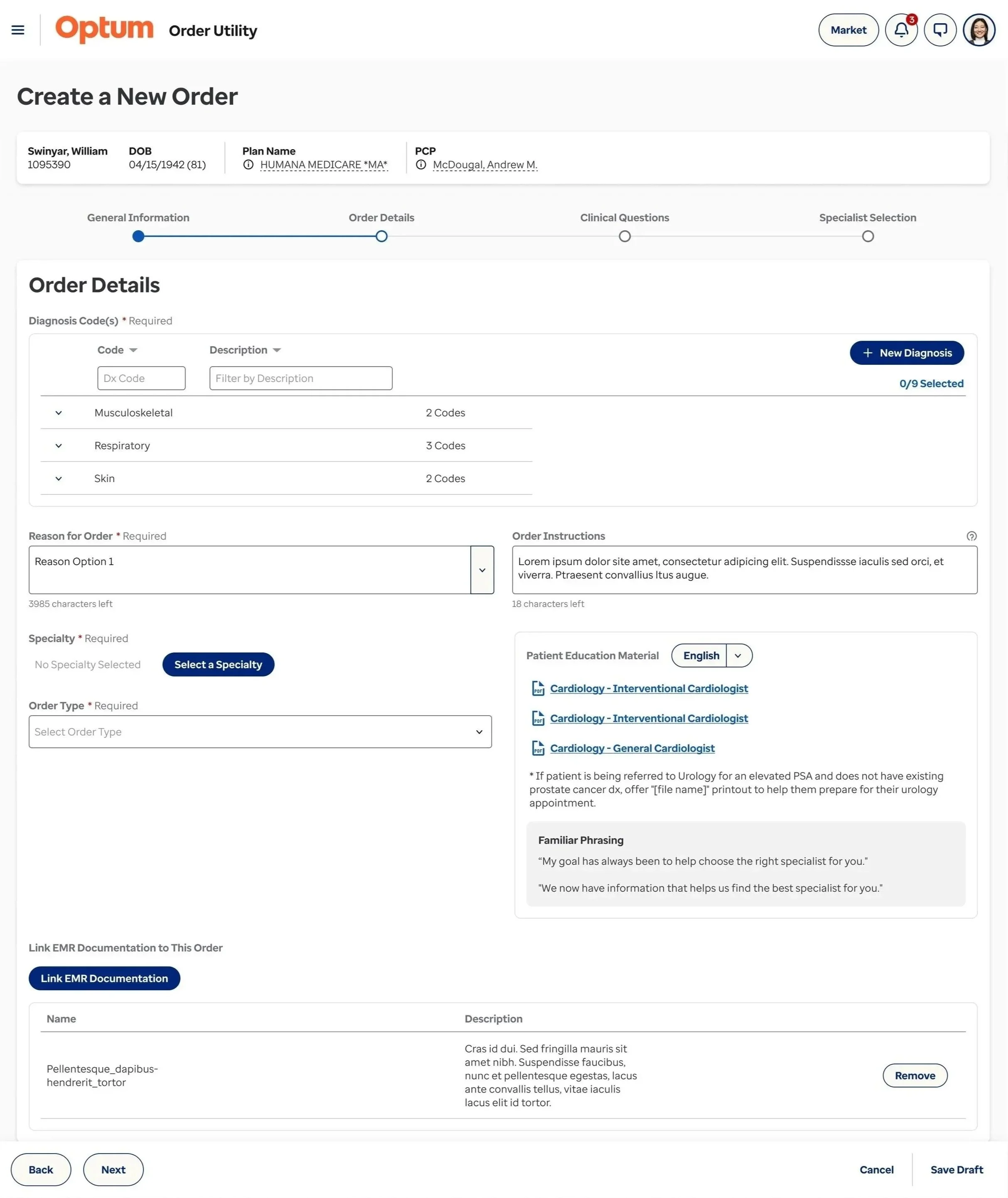
Step 2
Patient diagnostic details, reference material, and supporting documents.
-
![]()
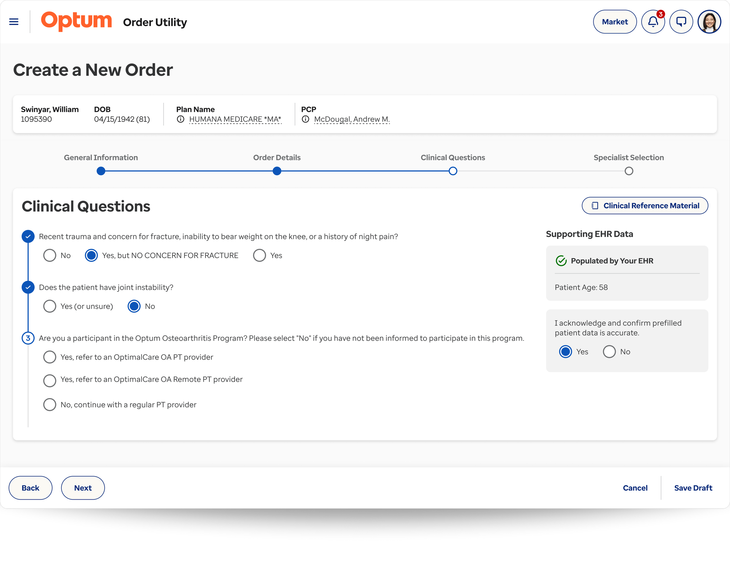
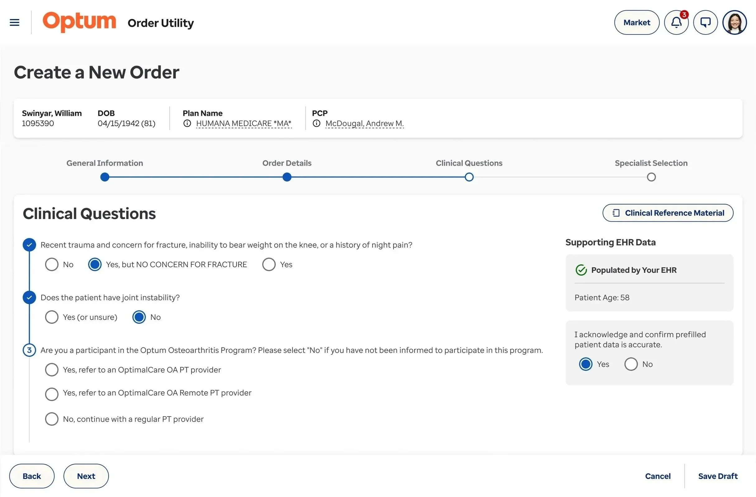
Step 3
Clinical questions (configurable based on treatment). This step is regulated to ensure that treatments are being appropriately administered to patients based on their diagnosis and specialty selection.
-
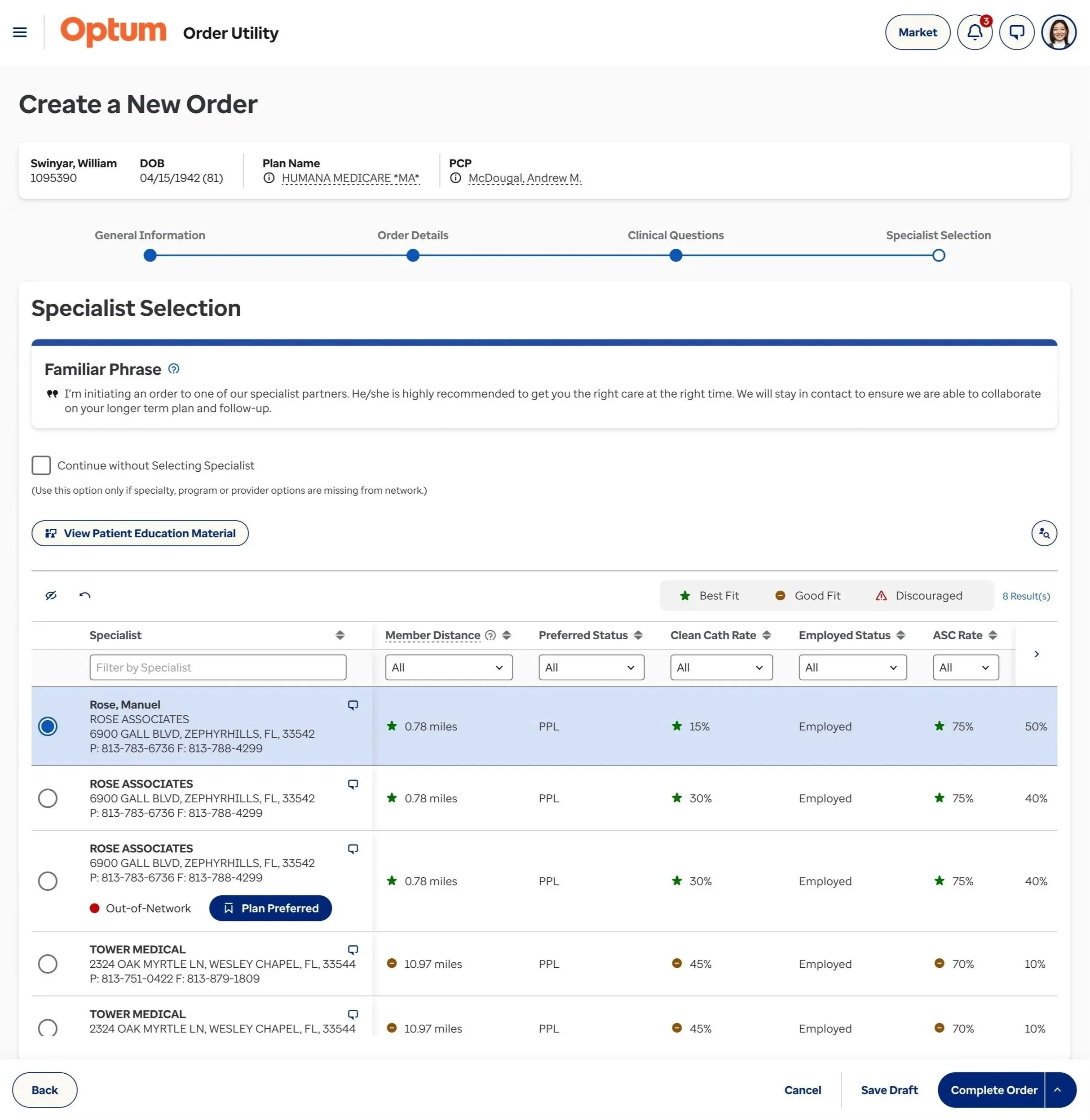
![]()
Step 4
Referral specialist selection. Factors are configured and displayed based on a number of criteria, such as specialty and treatment requested, market preferences, patient insurance, location, etc.
The Pay Dirt
The results of the new user flow were well received by the leadership team and end users during monthly user session groups. However, the final design has not been implemented due to budget and resource constraints. Therefore, ROI for these enhancements can not yet be measured.
Below are a few additional enhancements I designed based on user conversations. These were not specific pain points, but they significantly improved the user’s experience by providing autonomy, transparency, and informed decision-making.
Customizations, such as the “referral specialist comparison”, “persistent patient details”, and “specialty favorites”, were so well received by users that the team is finding ways to fit them into the 2026 enhancement schedule.
These examples are only a few of the enhancements I’ve made to Order Utility during my time as the senior product designer. I’d be happy to have a conversation and share additional examples.
New Order Creation Enhancements
Referral Specialist Comparison
Users expressed the desire to easily compare two specialists in a more comprehensive view. From the specialist grid, users are able to select two specialist and select “Compare” leading to the view above. From here they are able to compare the specialist’s details and all factors, as well as, change the specialist or directly select the specialist to create the referral.
News & Enhancements
Currently, the process of informing Order Utility users of product changes is by sending out enhancement, new feature, and bug fix updates to the Markets who distribute them to the users. In order to expedite this process and ensure all users have access to updates, I created an experience which incorporates the updates directly in the product and can be customized to each Market’s specific configurations.
Persistent Patient Details
Currently in Order Utility, users must scroll to the top of the page to reference pertinent patient information, such as, age and insurance details. This information is often necessary when completing clinical treatment questions and selecting the appropriate specialist to refer to. In addition to the patient information being persistent, it is also responsive. Order Utility works within multiple EHRs (electronic health records) whom have varying display size restrictions.
New User Preference Concepts
Custom Profile Picture
This concept would give the user the ability to customize their profile image which would be used across all Optum brand products. By default the system would use their initials.
Interface Layout
Due to the variation in age personas, many of the product users prefer less space between each field, and may want to revert back to the original “single-page” layout. This concept puts that control into the hands of the user, rather than assuming a “one-size-fits-all” approach.
Specialty Favorites
By default the favorited specialties are selected by the parent market. However, each physician using Order Utility does not have the same specialty or sub-specialty. For example, a pediatrician would benefit from having pediatric specialties selected as their favorites, rather than the subset the Market selected. This concept helps to expedite their referral order creation.